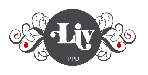
This was my initial design which I mocked up and too with me to my Bivouac interview in York....
I've carried them about since then, but I'm just not keen on them. They're too fussy and just not what I want. I'm not that fussy so therefore I just don't think they're right for me anymore. I like the concept behind it but just feel it needs to be simplified a little more. Here is the new design which I am now using instead...

At the moment I'm looking into getting them printed up for real and not just mocked up downstairs in digital print. But what I want to do is block foil an area of the new logo on the front. (The cards will still be back to back, with my details on the reverse.) My options will be one of the following:
1) Block foil Liv
2) Block foil the entire circle and swirls
3) Block foil the circle
4) Block foil the entire area behind the logo so there is no white space
At the moment I'm pretty set on option 1. This is because I feel the circle and swirls should all be kept the same colour and not separated. I also feel that block foiling the entire circle and swirls would detract away from the the logo which is 'Liv.' I want the foiling to be subtle, so it is just enough to add that extra touch but not be over powering so that the logo is lost. The only other thing to think about is weight of stock, type of stock and colour of stock. I know I want them to be a minimum of 400gsm, possibly heavier if I can. I also want them matt so that they have a nice feel and contrast well with the block foil.
Type layout development:


I also tried white out type on black and colour but I just don't like it as much as I like black type on white.

I was leaning towards a portrait layout because I like the way the type works on the reverse of that. However, I know that this just wouldn't be appropriate from the logo on the front. The way in which the logo works is set to a landscape format. Anything else, and it would just be lost when scaling down or pulling it about. Therefore I feel I will have to go with a landscape business card.
Logo layout development:

This was the initial logo which I just wanted centered, but it just wasn't working for me. Below are alternative layouts with the new logo I have decided to use.


This is my favourite layout so far and is most likely to be the one I go with.


No comments:
Post a Comment