Friday, April 23, 2010
Business Card Quotes
I've had responses back from: Generation Press, Wood & Richardson and Pressision. Each quote is very similar however, all quotes are way out of my price range. I thought this would be the problem I'd have... Now I need to either change my business cards to not be back to back if I want to try and pursue the block foiling effect or change my concept all together and get them printed with a spot UV varnish on them to make the whole thing cheaper. This puts me in a tricky situation because then I feel like I'm settling for second best if I go with the UV varnish finish as opposed to the foiling. Decisions decisions.
Wednesday, April 21, 2010
New Portfolio
My new portfolio has arrived today!
I ordered it from:
http://www.portfoliosplus.com/default.aspx
I'm really excited to pick it up. I got it delivered to my home address in York because it had to be signed for and there was no guarantee that someone would be home at my flat for it. So I'll be able to collect it Thursday night when I go home. It's a black Prat Pampa display book described as:
Prat Pampa Book with Matt Polypropylene Sleeves 143
'Black or burgundy red bonded leather presentation book. The modular spiral mechanism opens and closes to add or replace sleeves. Soft deluxe bonded leather cover and lappet closure. Black protective cover inside. Includes 20 matt polypropylene sleeves with luxury black paper inserts. Also see Pampa books containing the clearer polyester sleeves.'
These are couple of images I pulled offline of it:


Logo Update
I have been updating my logo again... No change there. I've had a couple of ideas that I wanted to experiment with. My initial design is just my name within a black circle. Simple black and white. Say it how it is. That's me. But then I got into thinking how I am as a designer and not just as a person. I want my logo to say something about me and the way I work. My approach to briefs and my specialism. So, I started experimenting with including some illustrative lines and placing them behind the circle so it appears that they are coming out of the centre.
This was my initial design which I mocked up and too with me to my Bivouac interview in York....
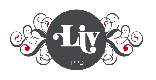
I've carried them about since then, but I'm just not keen on them. They're too fussy and just not what I want. I'm not that fussy so therefore I just don't think they're right for me anymore. I like the concept behind it but just feel it needs to be simplified a little more. Here is the new design which I am now using instead...

At the moment I'm looking into getting them printed up for real and not just mocked up downstairs in digital print. But what I want to do is block foil an area of the new logo on the front. (The cards will still be back to back, with my details on the reverse.) My options will be one of the following:
1) Block foil Liv
2) Block foil the entire circle and swirls
3) Block foil the circle
4) Block foil the entire area behind the logo so there is no white space
At the moment I'm pretty set on option 1. This is because I feel the circle and swirls should all be kept the same colour and not separated. I also feel that block foiling the entire circle and swirls would detract away from the the logo which is 'Liv.' I want the foiling to be subtle, so it is just enough to add that extra touch but not be over powering so that the logo is lost. The only other thing to think about is weight of stock, type of stock and colour of stock. I know I want them to be a minimum of 400gsm, possibly heavier if I can. I also want them matt so that they have a nice feel and contrast well with the block foil.
Type layout development:


I also tried white out type on black and colour but I just don't like it as much as I like black type on white.

I was leaning towards a portrait layout because I like the way the type works on the reverse of that. However, I know that this just wouldn't be appropriate from the logo on the front. The way in which the logo works is set to a landscape format. Anything else, and it would just be lost when scaling down or pulling it about. Therefore I feel I will have to go with a landscape business card.
Logo layout development:

This was the initial logo which I just wanted centered, but it just wasn't working for me. Below are alternative layouts with the new logo I have decided to use.


This is my favourite layout so far and is most likely to be the one I go with.
This was my initial design which I mocked up and too with me to my Bivouac interview in York....
I've carried them about since then, but I'm just not keen on them. They're too fussy and just not what I want. I'm not that fussy so therefore I just don't think they're right for me anymore. I like the concept behind it but just feel it needs to be simplified a little more. Here is the new design which I am now using instead...

At the moment I'm looking into getting them printed up for real and not just mocked up downstairs in digital print. But what I want to do is block foil an area of the new logo on the front. (The cards will still be back to back, with my details on the reverse.) My options will be one of the following:
1) Block foil Liv
2) Block foil the entire circle and swirls
3) Block foil the circle
4) Block foil the entire area behind the logo so there is no white space
At the moment I'm pretty set on option 1. This is because I feel the circle and swirls should all be kept the same colour and not separated. I also feel that block foiling the entire circle and swirls would detract away from the the logo which is 'Liv.' I want the foiling to be subtle, so it is just enough to add that extra touch but not be over powering so that the logo is lost. The only other thing to think about is weight of stock, type of stock and colour of stock. I know I want them to be a minimum of 400gsm, possibly heavier if I can. I also want them matt so that they have a nice feel and contrast well with the block foil.
Type layout development:


I also tried white out type on black and colour but I just don't like it as much as I like black type on white.

I was leaning towards a portrait layout because I like the way the type works on the reverse of that. However, I know that this just wouldn't be appropriate from the logo on the front. The way in which the logo works is set to a landscape format. Anything else, and it would just be lost when scaling down or pulling it about. Therefore I feel I will have to go with a landscape business card.
Logo layout development:

This was the initial logo which I just wanted centered, but it just wasn't working for me. Below are alternative layouts with the new logo I have decided to use.


This is my favourite layout so far and is most likely to be the one I go with.
Tuesday, April 20, 2010
Business card update...
I've been searching for a printers that do block foiling on business cards. I have found a few that do it, but it's just a matter of whether or not it might be feasible to go through with it. Foiling is something I would really like to add to my business cards once I have settled on my over all design.
These are the names and links to a few sites I have looked at so far:
Auroraprint - http://www.auroraprint.co.uk/
Generation Press - http://generationpress.co.uk/
Duffield Printers - http://www.duffieldprinters.co.uk/index.php
Target Print - http://www.targetprint.co.uk/
AFP Design and Print - http://www.afpdesign.co.uk/index.htm
Gold Design Print Ltd - http://www.gdpl.co.uk/
Print Leeds - http://www.print-leeds.co.uk/
Subscribe to:
Posts (Atom)
